In this post I’d like to present an exploration of the Color panel and Color picker and a proposal for their improvement.
This work is based on the designs of the Inspector Sidebar that fellow WordPress contributor Shaun Andrews is currently carrying out. If you haven’t done this yet, I encourage you to read these two posts:
There is also exciting work being done in the context of Global Styles by Matías Ventura (Lead architect of the Gutenberg project) and Pablo Honey (Design Lead at Automattic) that share many of the same objectives and principles. Aligning these projects will be essential to reach a cohesive design and an easy-to-understand & use system.
Before I present my designs, let’s look at the current state of the UI to select colors and then see how the changes I propose could solve several issues.
Here’s a screenshot of an actual Color section that will haunt you at night:
Despite being an extreme case, the evident problems with the previous interface are a product of the underlying solution we have in place.
More realistically, here’s a collection of screenshots that reflect the different kinds of the color UIs:
Depending on the type of block users are customizing, the panel will present more or fewer options. For instance, the Paragraph Block allows changing the text, background, and link colors, while the Separator Block only allows changing the line color.
As you can see in the image above, the general interface presents several problems:
- The color panel takes a lot of space and is quite noisy ❶: even when it only presents a single color ❷ there are many distracting elements competing for the user’s attention (like the solid and gradient selector, and the custom color & clear links).
- When there are more colors to customize, that amount of elements is multiplied by the number of additional colors. And the problem is compounded when the user selects a gradient, because we present the UI inside the sidebar ❸.
- The preview element is redundant in the expanded section and when it gets closed ❹ it doesn’t give helpful information.
- The clear button is always visible and clickable ❺, even when you can’t clear anything.
- In general, the UI doesn’t scale well (please refer to the cursed image above). Adding more background options (like an image background, or a new kind of gradient) or displaying sets of custom colors, would require a significant effort on design and implementation.
How can we fix this?
In our respective explorations, Shaun and I have been trying to reduce the amount of information that the sidebar displays and moving secondary controls inside flyout menus. We’ve also worked on making the individual controls more compact and easier to read.
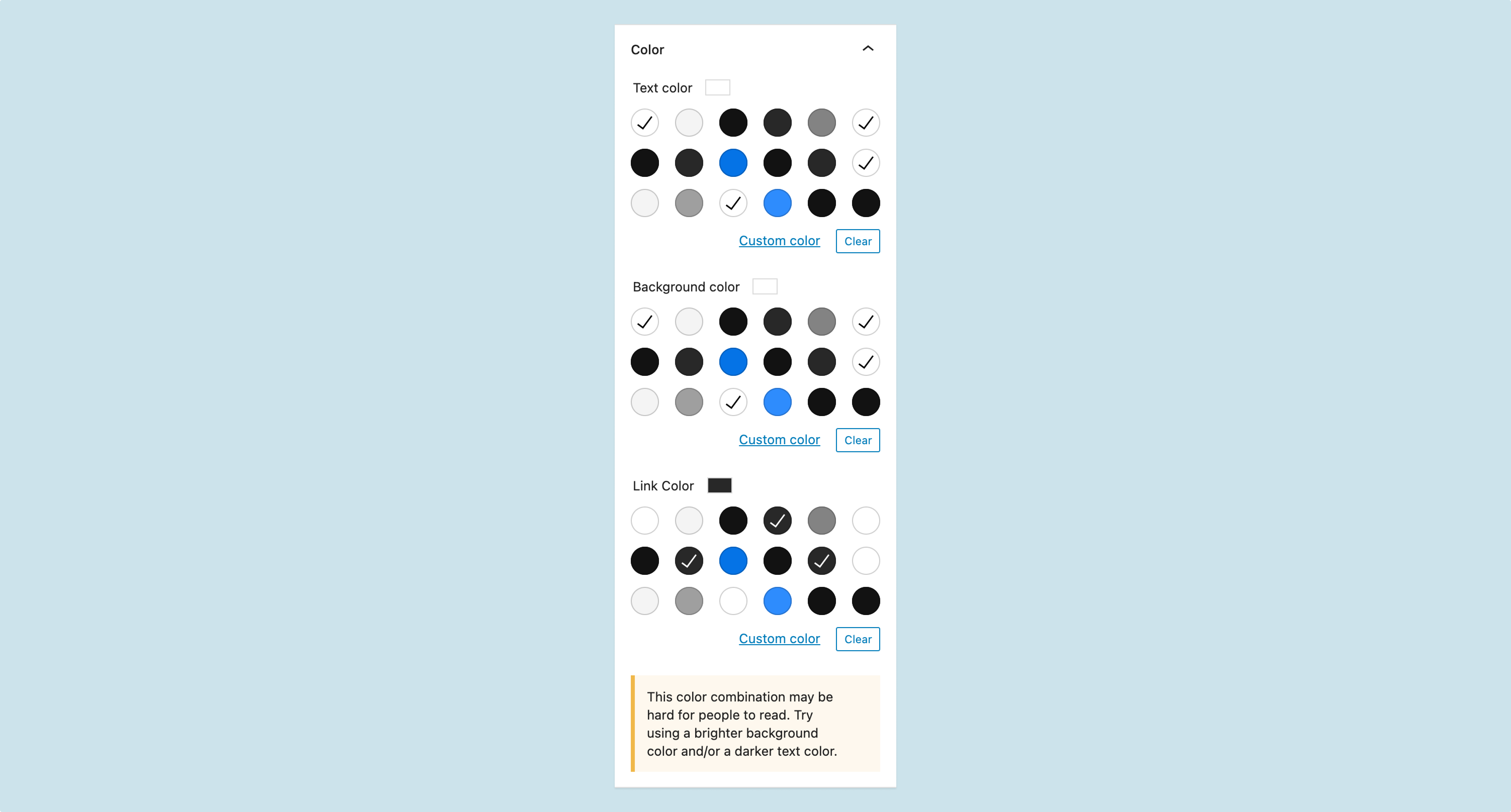
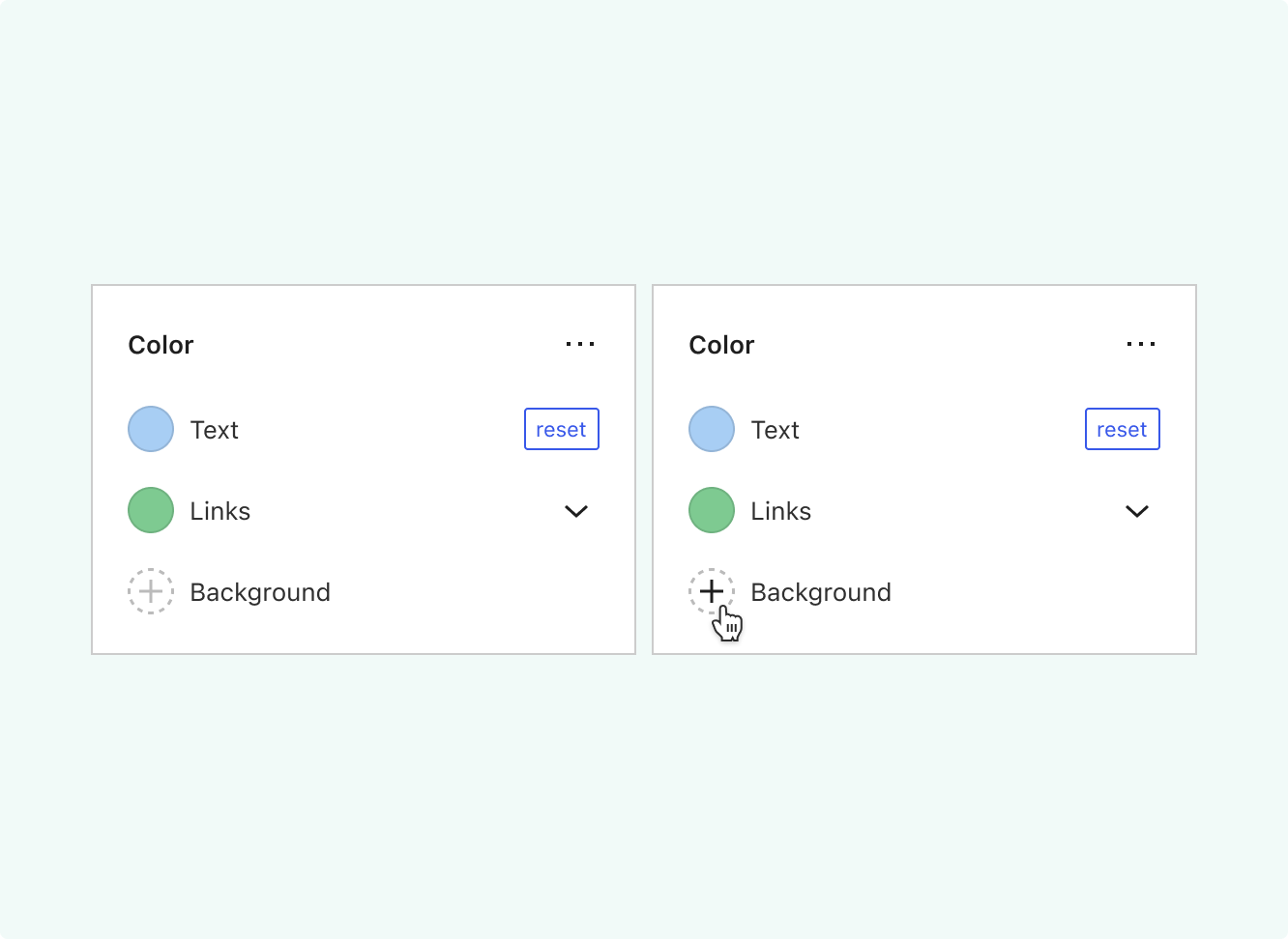
Here’s a simple screen with a redesigned color section:
You can read that section as follows:
- The text color is blue and can be reverted to its original value.
- Links are green by default (we’ll see why there’s a dropdown there in a minute)
- Since the color combination could be difficult to read, we suggest a couple of simple fixes.
If one of the items doesn’t have a default image or a color (as it’s usually the case with the Background item), we’ll render something like this:
Contrast this UI with the current one, much more complicated to read because of all the elements fighting for the user’s attention.
Customizing the links
In a past Show & Tell, Shaun wondered how could we offer more ways to customize certain things, like the color of the different states for the links. Here’s where the dropdown I mentioned earlier comes into play:
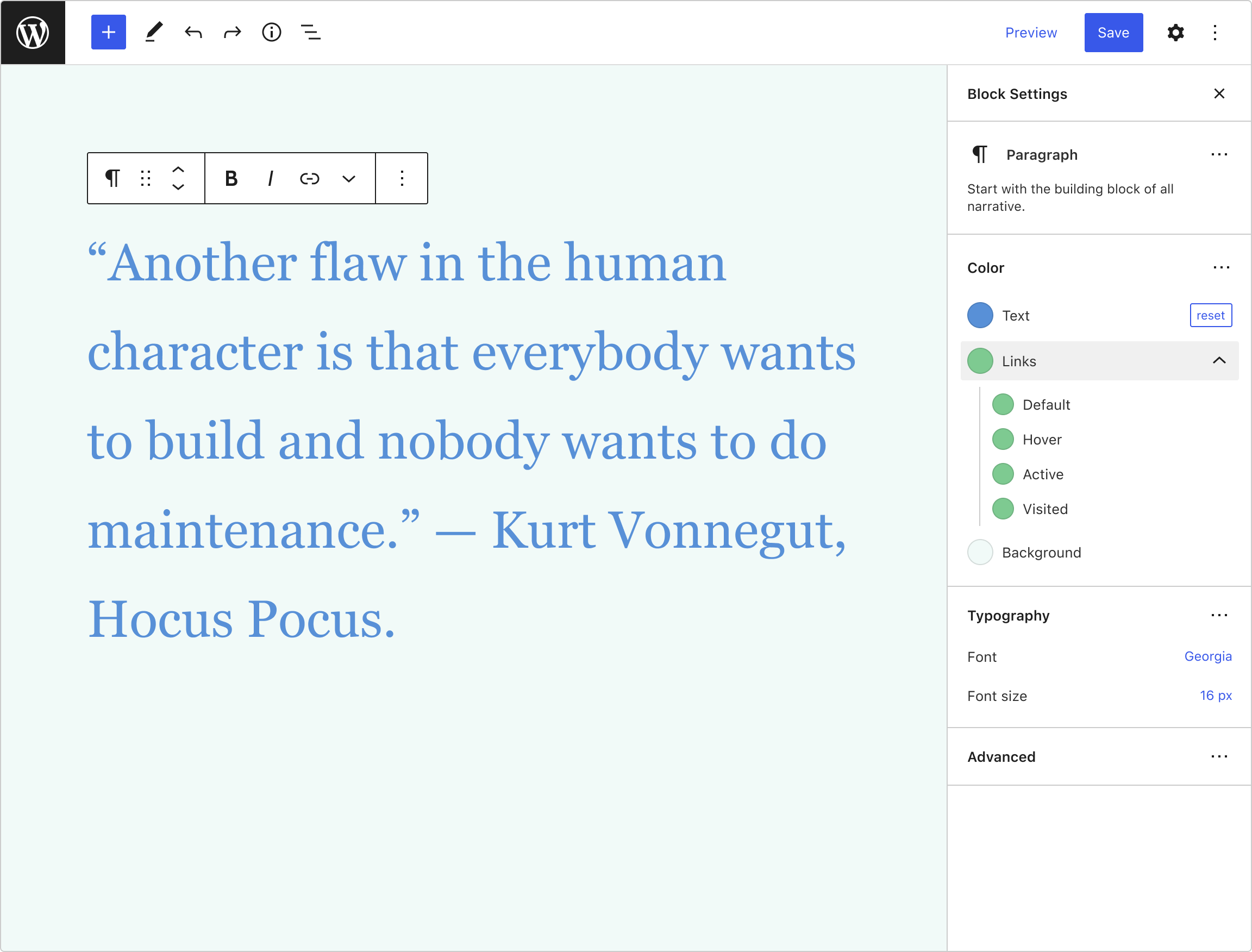
In the previous image, if users expand the Link item, they’ll be offered a list of states (the names come from the official pseudo CSS classes :link, :visited, :hover and :active, but I renamed :link to default).
If the inner colors are modified, the Link item will show a list of colors:
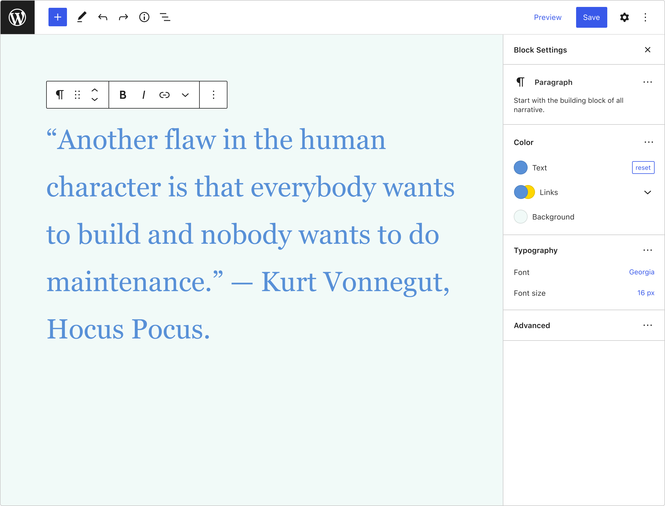
This is similar to the collapsed state for the color section, but since the context is more specific here, it’ll be more helpful for the users.
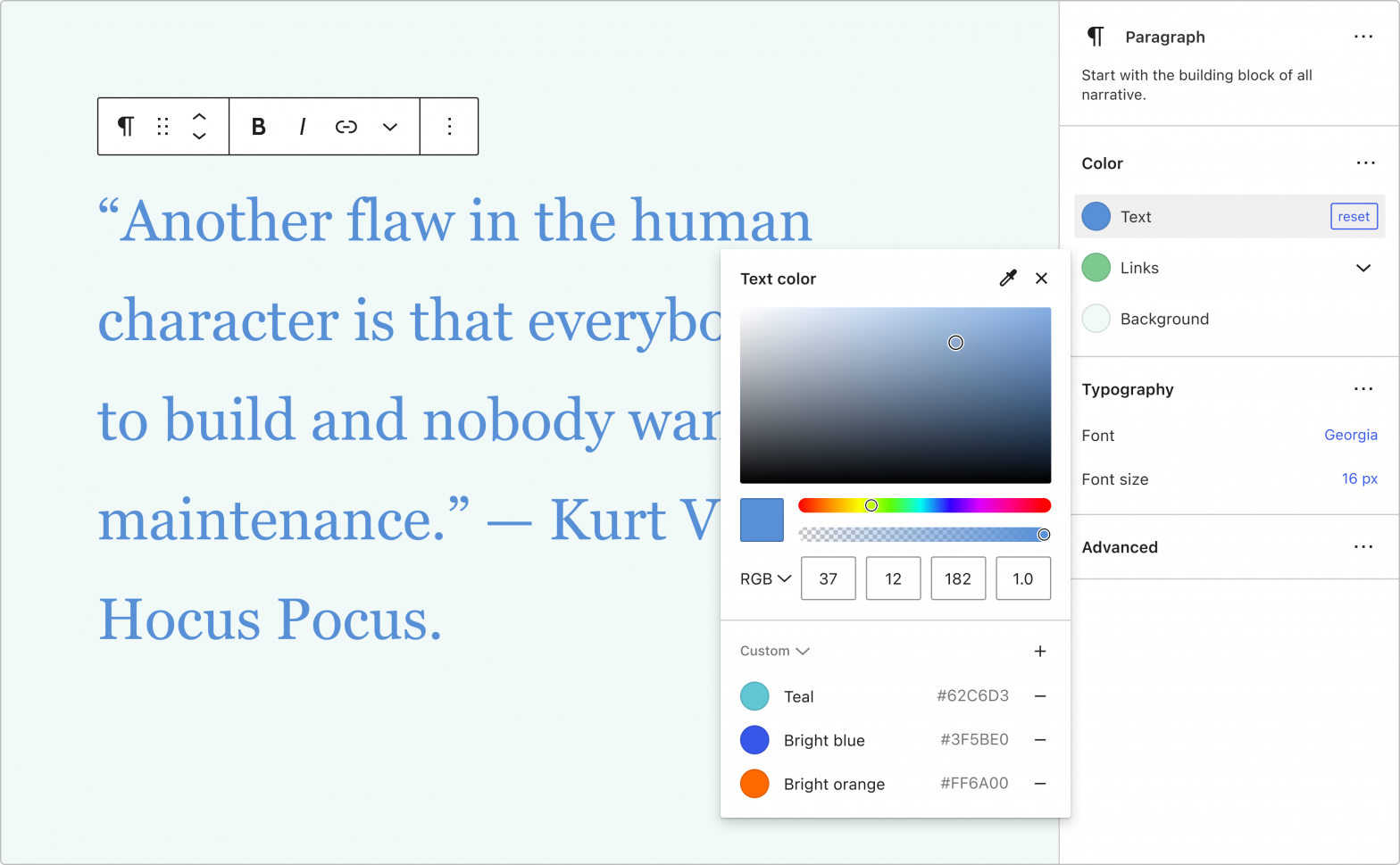
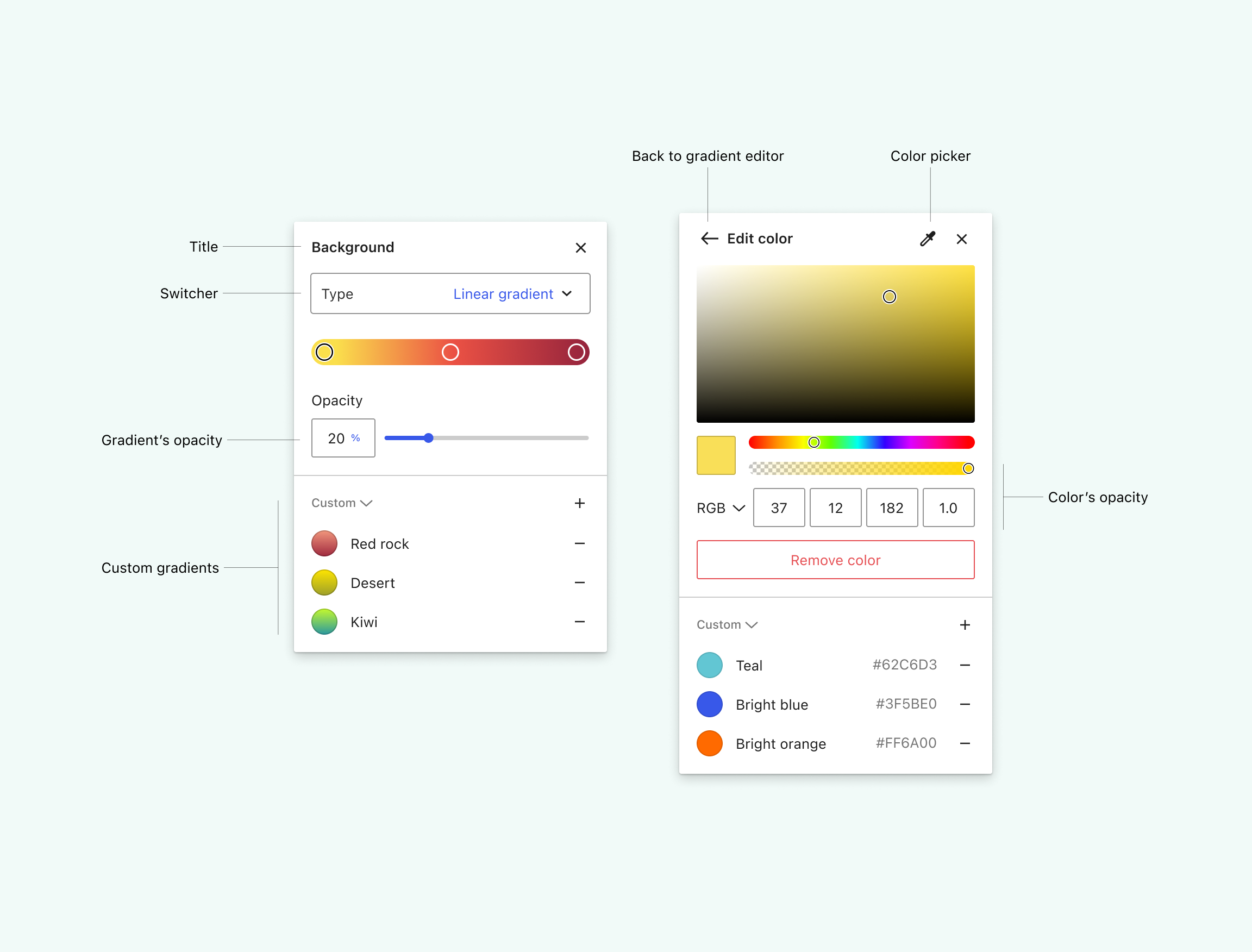
Picking colors
When the user clicks on a color, a color picker will appear beside the sidebar:
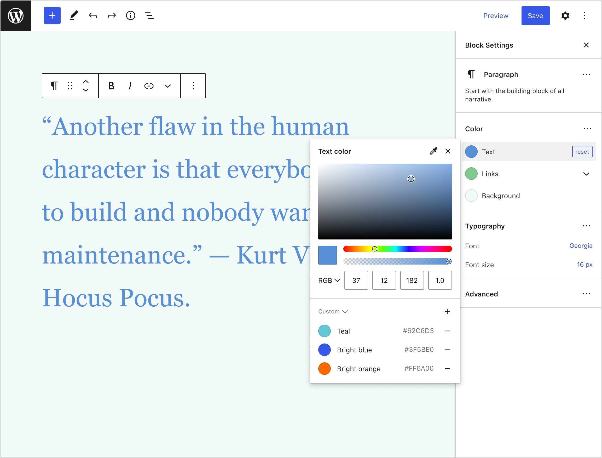
Here’s a breakdown of its different elements:
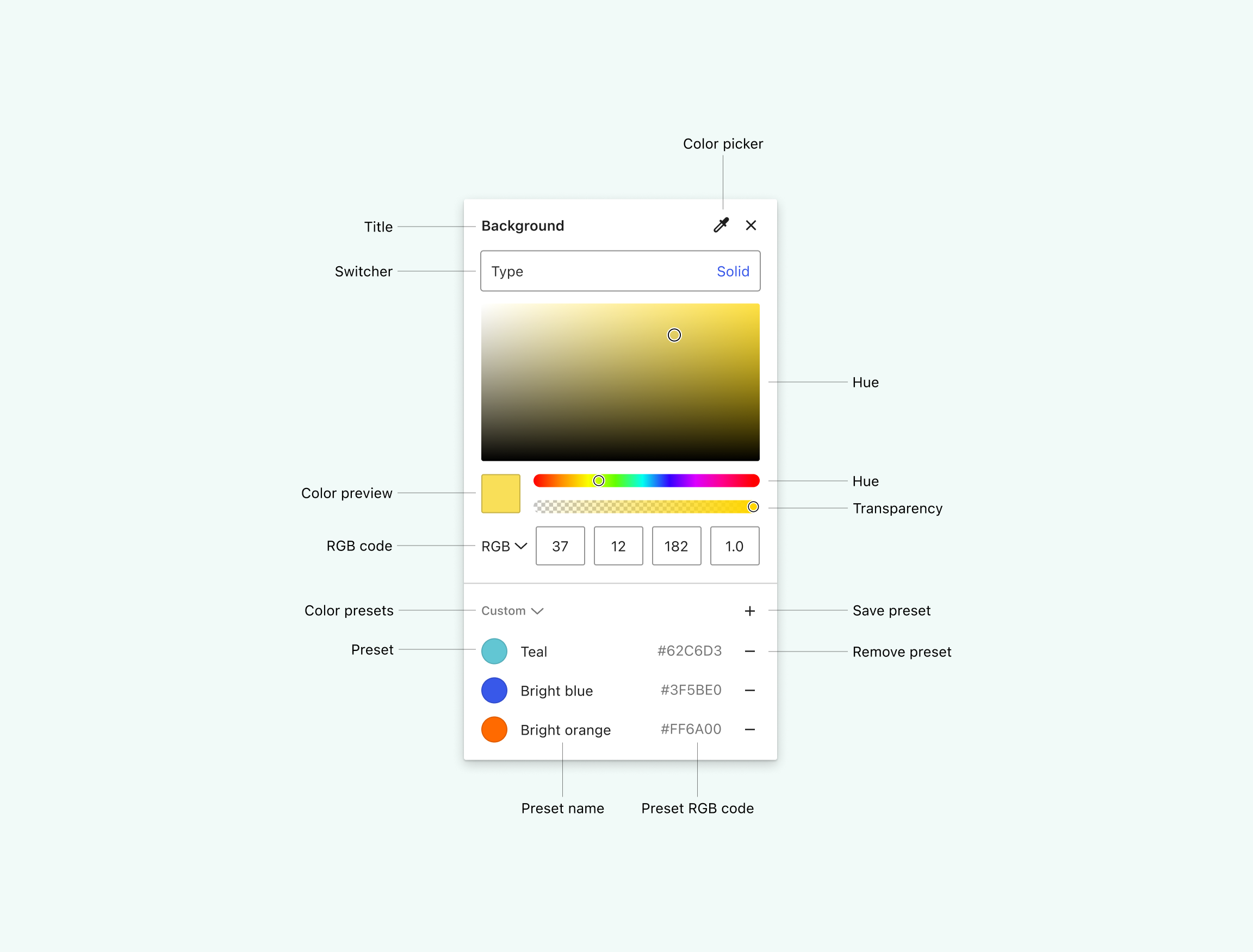
The section at the bottom of the color picker contains two collections: Theme colors and Custom colors. Users can save colors using the plus sign from either collection (but the colors will be always added to the custom one). After doing that they’ll be offered an input field to name the color.
We could use a name color API to suggest an initial value (although those libraries usually only contain English words). If that were difficult to implement, we could simply insert the word “color” plus a consecutive number.
Allowing users to define and manage their own palettes could be a great feature for users. This idea is also present in the Global Styles Interface.
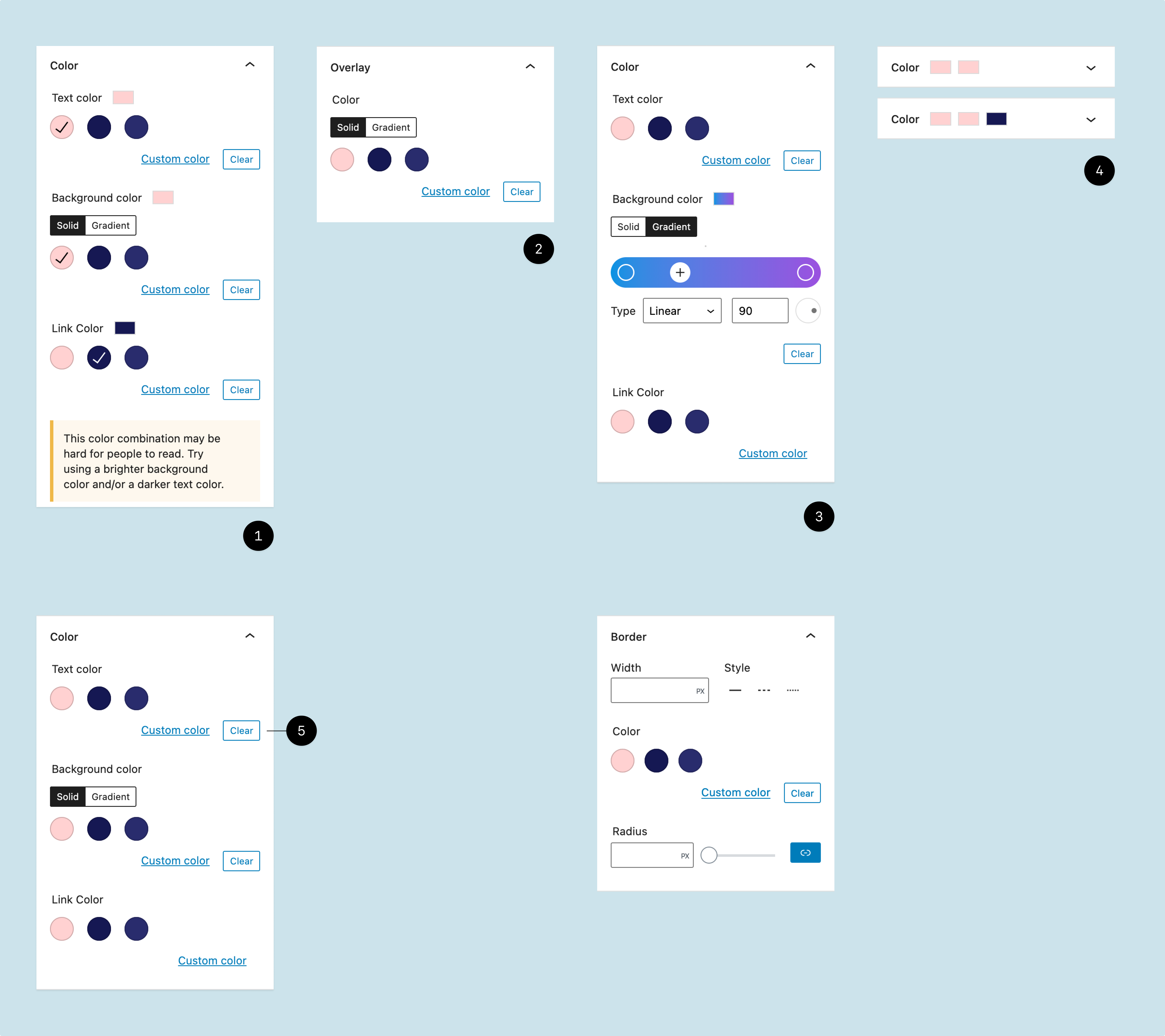
The dropdown at the top of the menu, allows changing the type of background, and it’s also a new component:

I explored different variations and chose the last option because:
- It shows a label and its value in one row.
- It can be read as a dropdown.
- I gives enough space for internationalization.
Image picker
If the user sets the type of background to Image, we’ll show this UI instead:
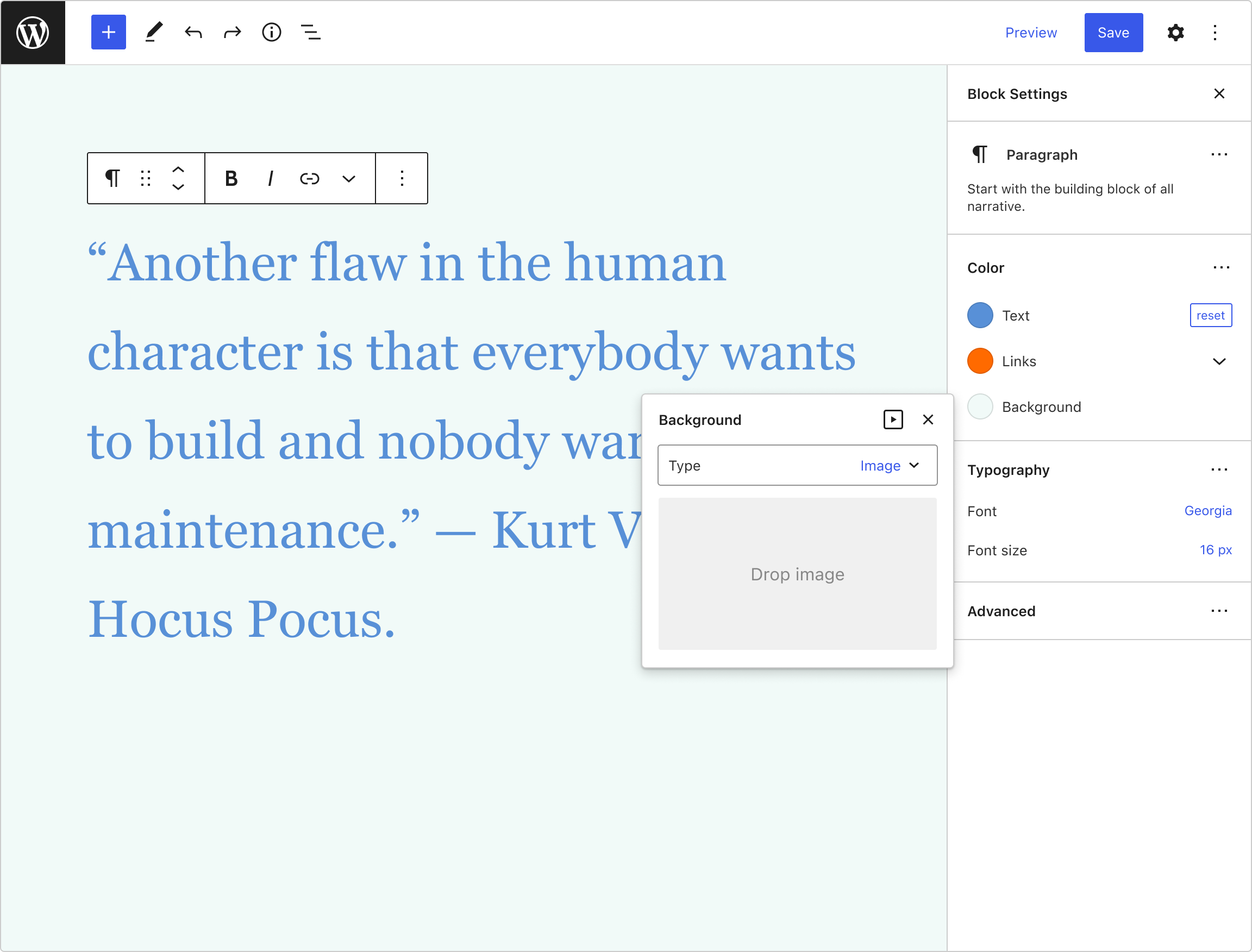
In this case, there are three possible actions:
- Drop an image.
- Click the icon on the top of the menu to open the Media library.
- Click the drop area to open the File browser.
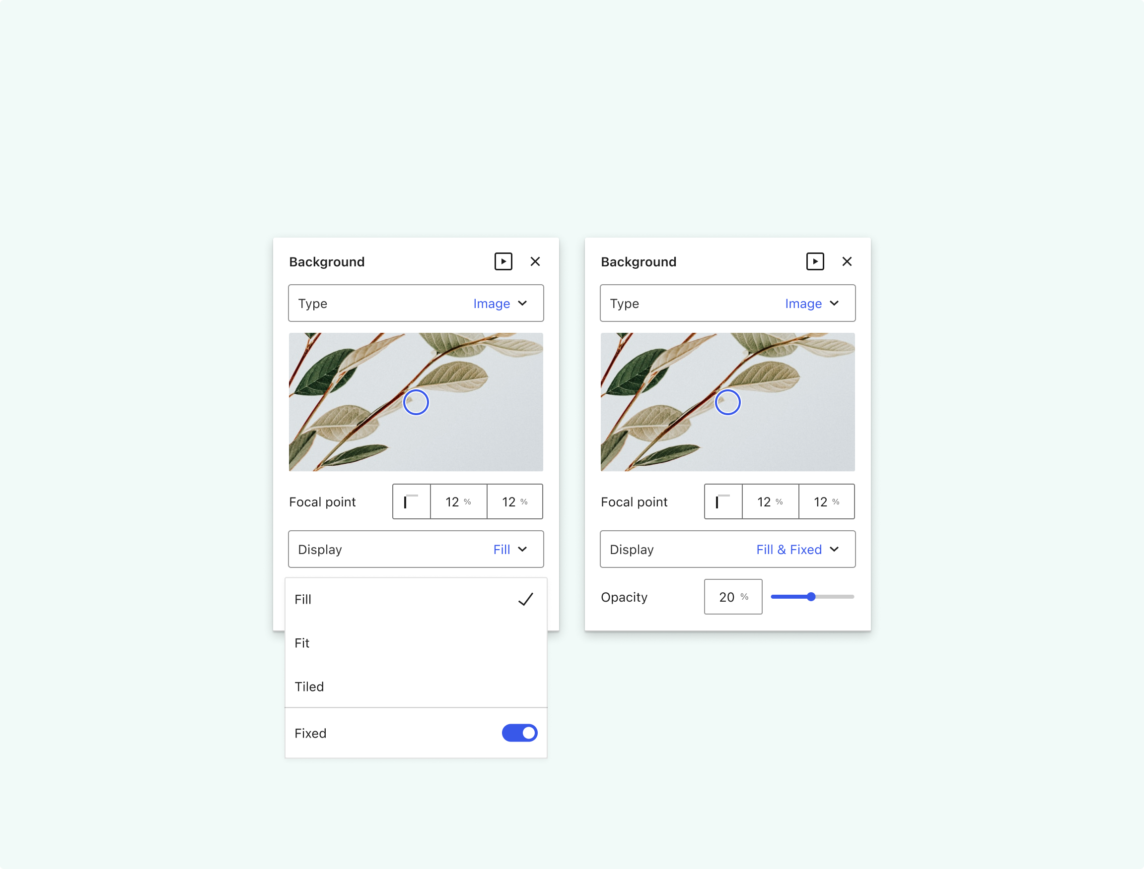
Once an image is loaded, we offer more options:
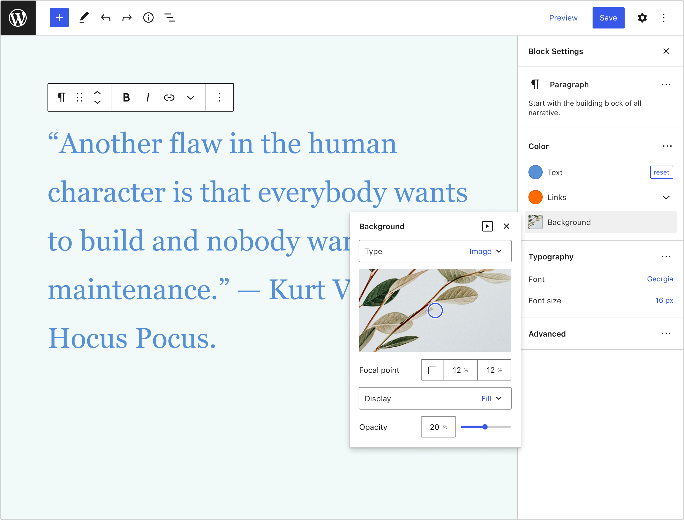
The dropdown for the display settings is a bit special and also gives the option to fix the background. This helps to reduce the flyout menu footprint and groups the display options together:
Gradient picker
Following the same logic of reducing the overall footprint of the UIs as much as possible, I split the interface of the Gradient picker in two.
When users select Linear gradient, they’ll be able to customize the basic gradient settings by moving the color handlers and setting the overall opacity. Then, if they click on a color, the menu will reveal a new interface to either edit the color or remove it from the gradient.
This separation of tasks allows us to offer a custom collection of gradients and a custom collection of colors.
We could use a similar UI for other types of gradients.
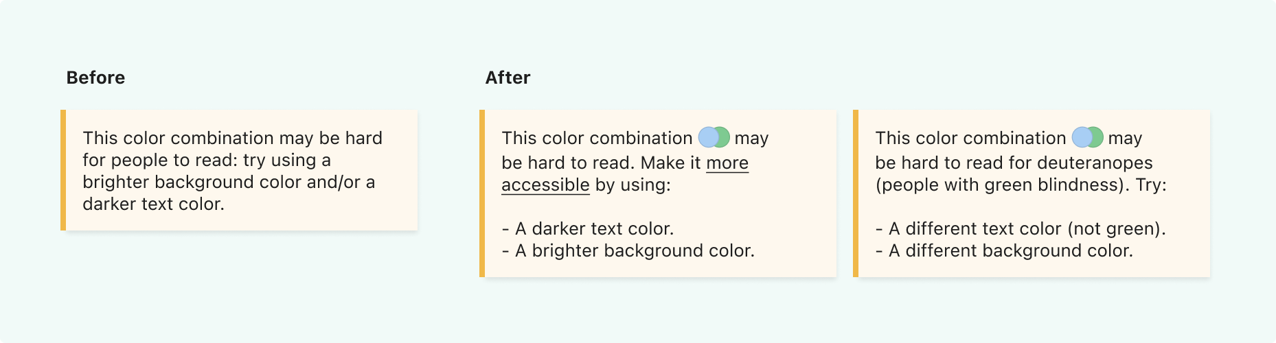
Color combinations alerts
Finally, I’d like to share some ideas to improve the alerts we show when the color combination has a lower contrast.
The first simple fix could be just showing the instructions in a list, so the message is easier to read. We could also explicitly show the problematic combination rendering the affected colors, and, finally, we could inform about more types of problems for people with different kinds of visual impairments.
Updated on Sep 21st: Here’s a related issue for these alerts.
Related issues
Here’s a list with some GitHub issues related to the designs and ideas presented in this post:
• Background Tools
• Updated ColorPicker
• Allow showing default palettes in addition to theme ones
• Add background colour transparency to blocks that support background colour
• Gradient Tool: Add Radial Direction Option
Thanks
I hope you like this review. All the designs for this exploration can be accessed in this Figma file, where you can also find more detailed UIs.
Shout-out to Channing Ritter (Product Designer at Automattic) for helping me proofreading and improving this post.
4 responses to “Interaction of color”
Excellent exploration! I love how you all both simplified the experience and found a way to add in more useful context at the same time.
Thanks a lot, Anne!
[…] of Exploration: Javier Arce presents in his post Interaction with Colors an exploration of the Color panel and Color picker and a proposal for their improvement. In their […]
[…] of Exploration: Javier Arce presents in his post Interaction with Colors an exploration of the Color panel and Color picker and a proposal for their improvement. In their […]