In this issue Matias proposes to expand the capabilities of the Cover block (and other blocks that use background images) “to empower users to achieve more varied visual effects easily”.
In this post, I’ll be exploring how to implement the suggested functionalities from the original issue (repositioning, resizing, and setting a background color), plus also three other functionalities (which in the context of this feature could have a lot of sense):
- Cropping
- Rotating
- Tiling
A couple of caveats
The cropping, and rotating controls already exist in the Image block, but I’d like to explore an alternative way to work with these tools, closer to the way software like Figma, Sketch, or Framer does.
Although I think many of this designs will work in smaller viewports, I haven’t designed a responsive version yet.
Edit background
As suggested by Matias in the original issue, users could invoke the background editing options via a new toolbar item called “Edit background”. However, to avoid having very wide toolbars, we could use an icon instead.
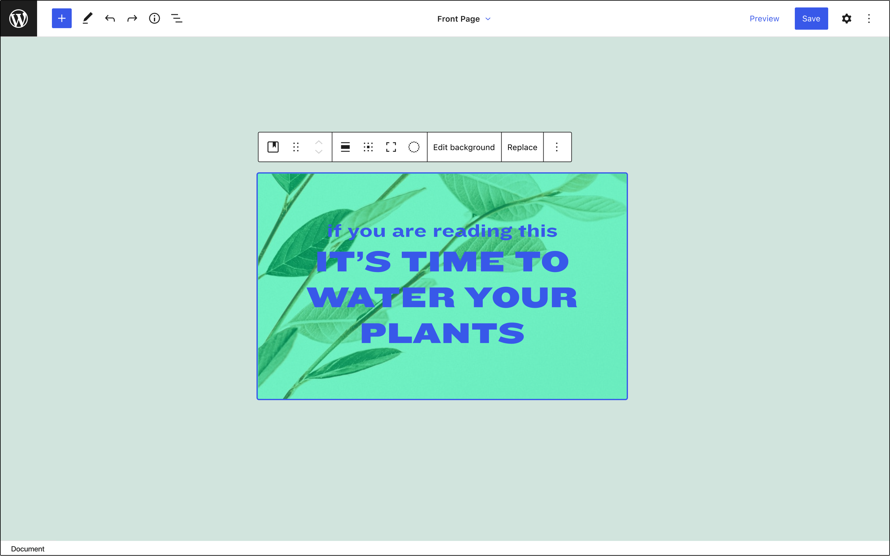
When the user clicks on “Edit background”, the toolbar changes and presents a new set of options, including one that allows setting the display mode (Fill, Fit, Crop, Tile), a button to exit the Edit mode, and another one to revert the applied changes. In the Cover block, entering in this mode will also fade out the overlay text and its background.
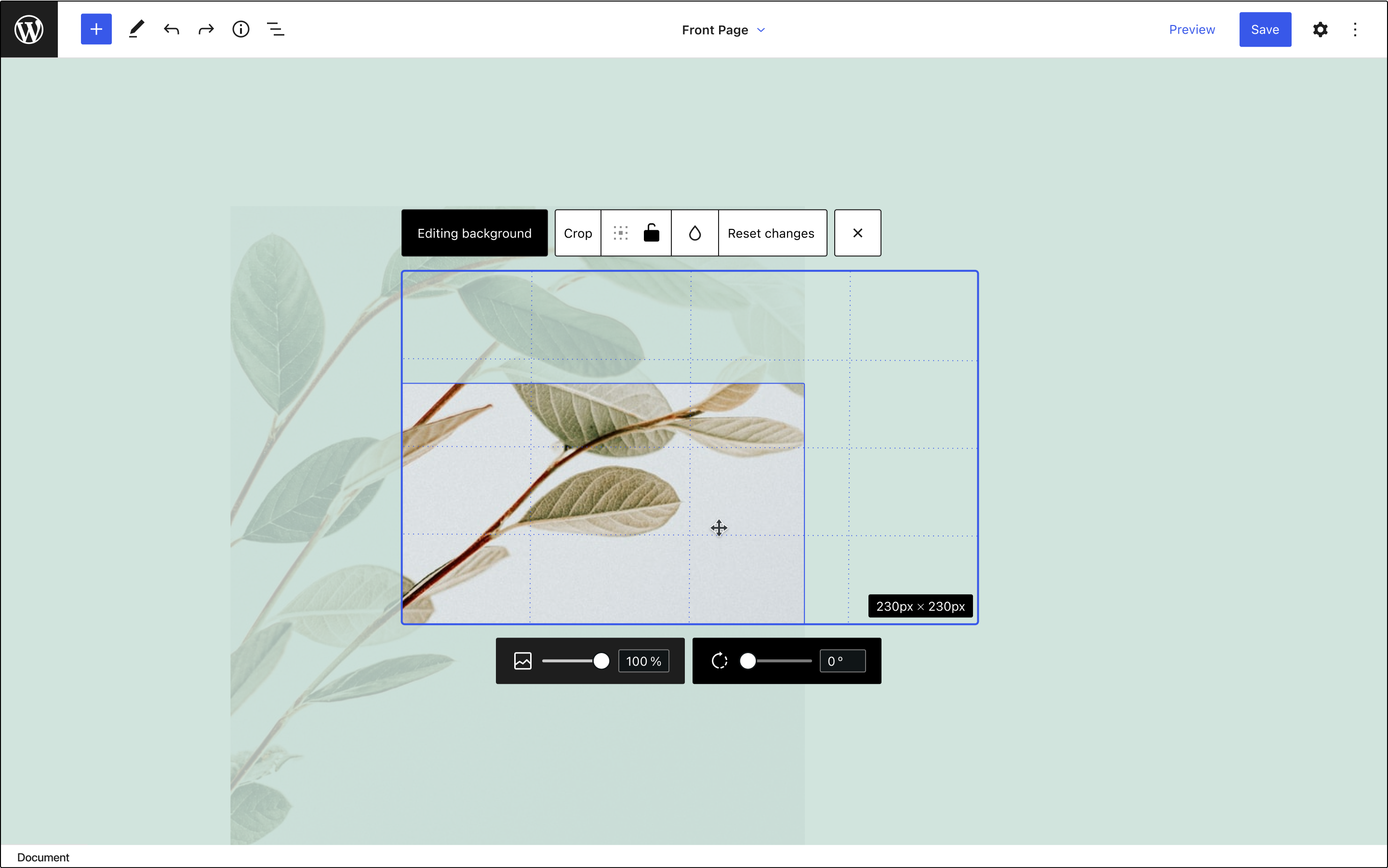
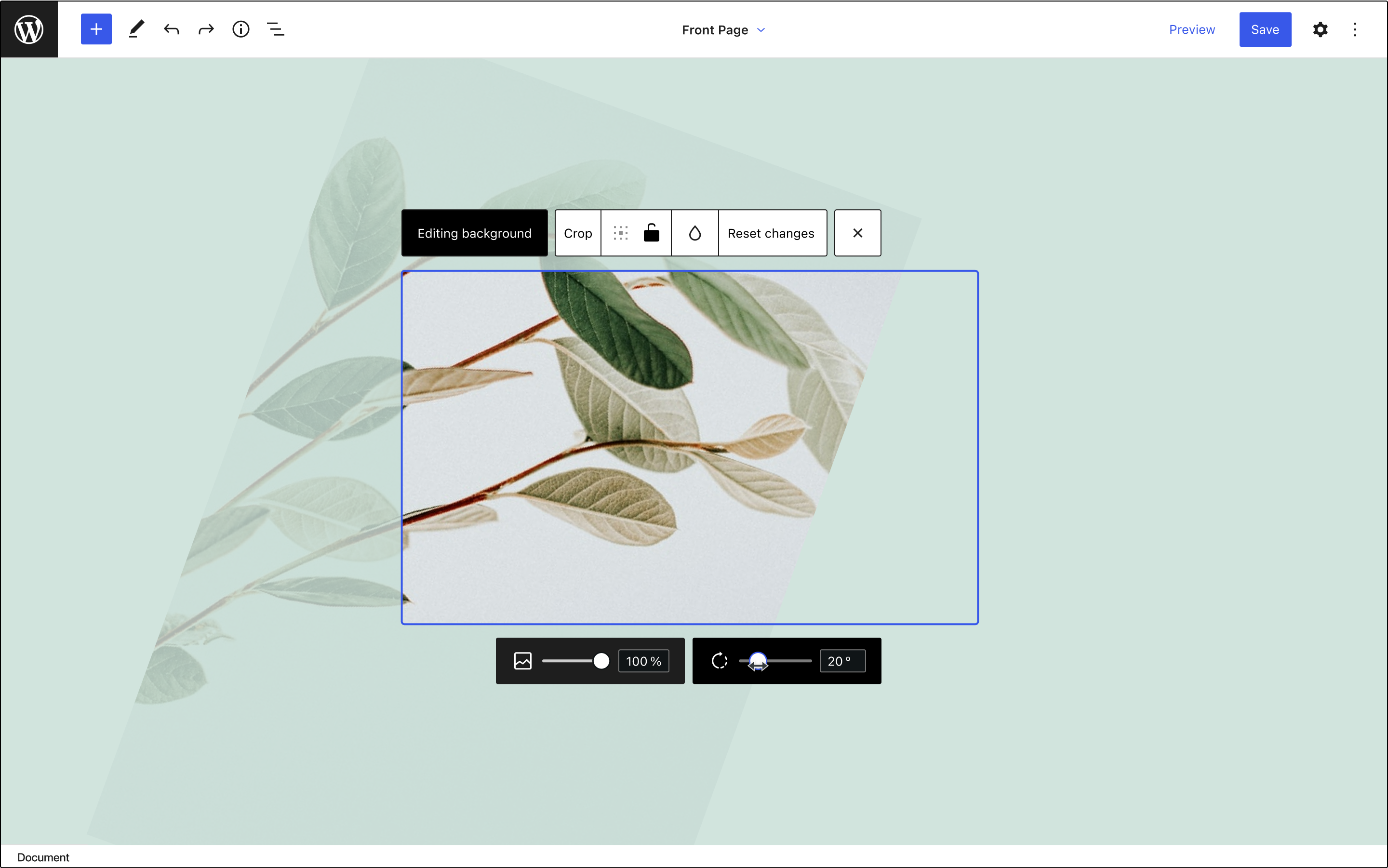
The current Image block requires applying the changes made in the Crop mode explicitly. In this exploration however, every change is automatically saved, and the modifications applied to the image can be reverted completely.
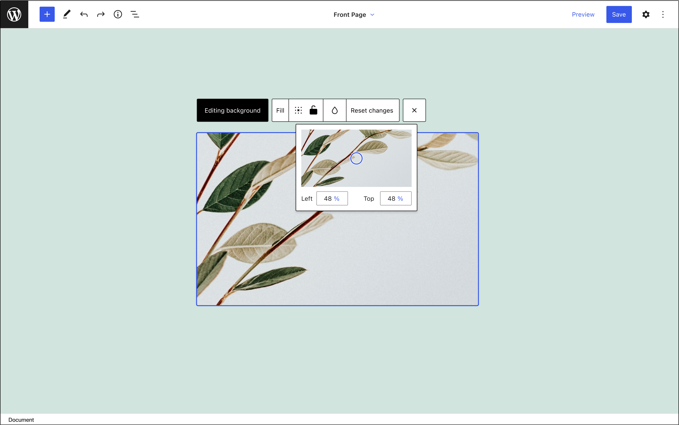
Fill mode
From the default display mode (“Fill”), the toolbar gives access to the Focal point picker and allows fixing the image (an option that is currently accesible from the sidebar). Those two options appear in the toolbar so it’s possible to manage every background setting from a single place.
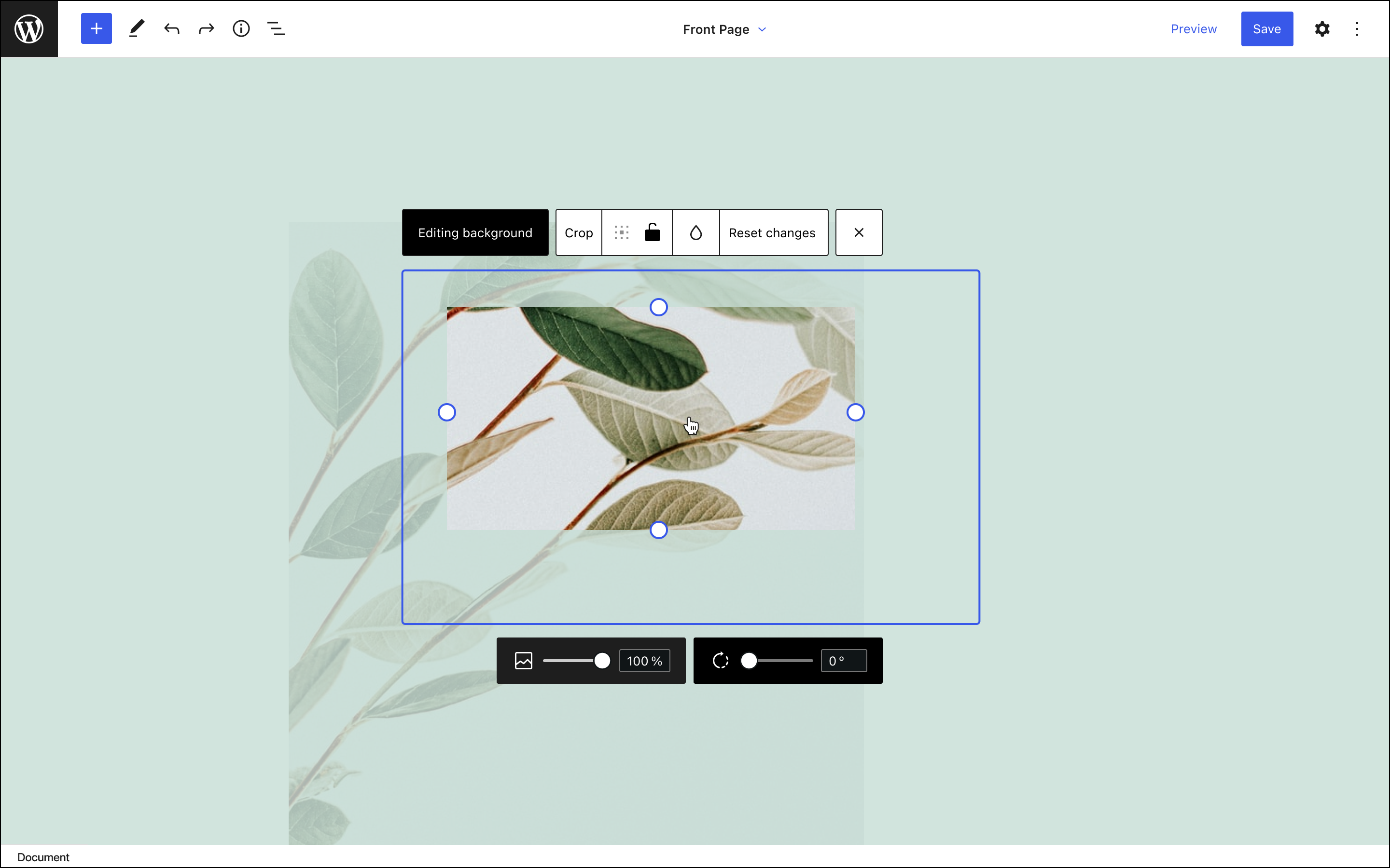
Crop mode
Options to zoom and rotate the image are also available in the Crop mode through a new toolbar at the bottom of the block.
This is how this mode works:
- When the user drags the image, the cropping indicators will disappear, a grid will be overlayed, and the interface will show a label with the x and y coordinates.
- Users can also move the image with the arrow keys (for extra precision, shift + key could also displace it in smaller increments).
- Every part of the image that lays outside of the boundaries of the block will have a lower opacity, indicating that that part of the image won’t be visible in the published version.
- If the user clicks on the image, we’ll overlay the cropping controls.
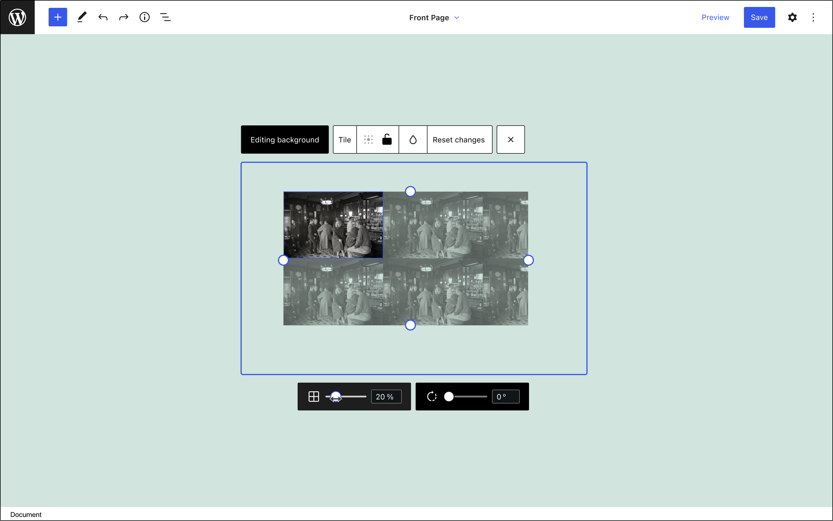
Tile mode
The Cover block has a setting for “Repeated background” in the sidebar that I propose to rename it to “Tile” and place it in the toolbar with the other display modes.
If the user has that option enabled, the size control will affect the size of each tile and the image will fill the area defined by the cropping handles. In this mode, rotation is also available.
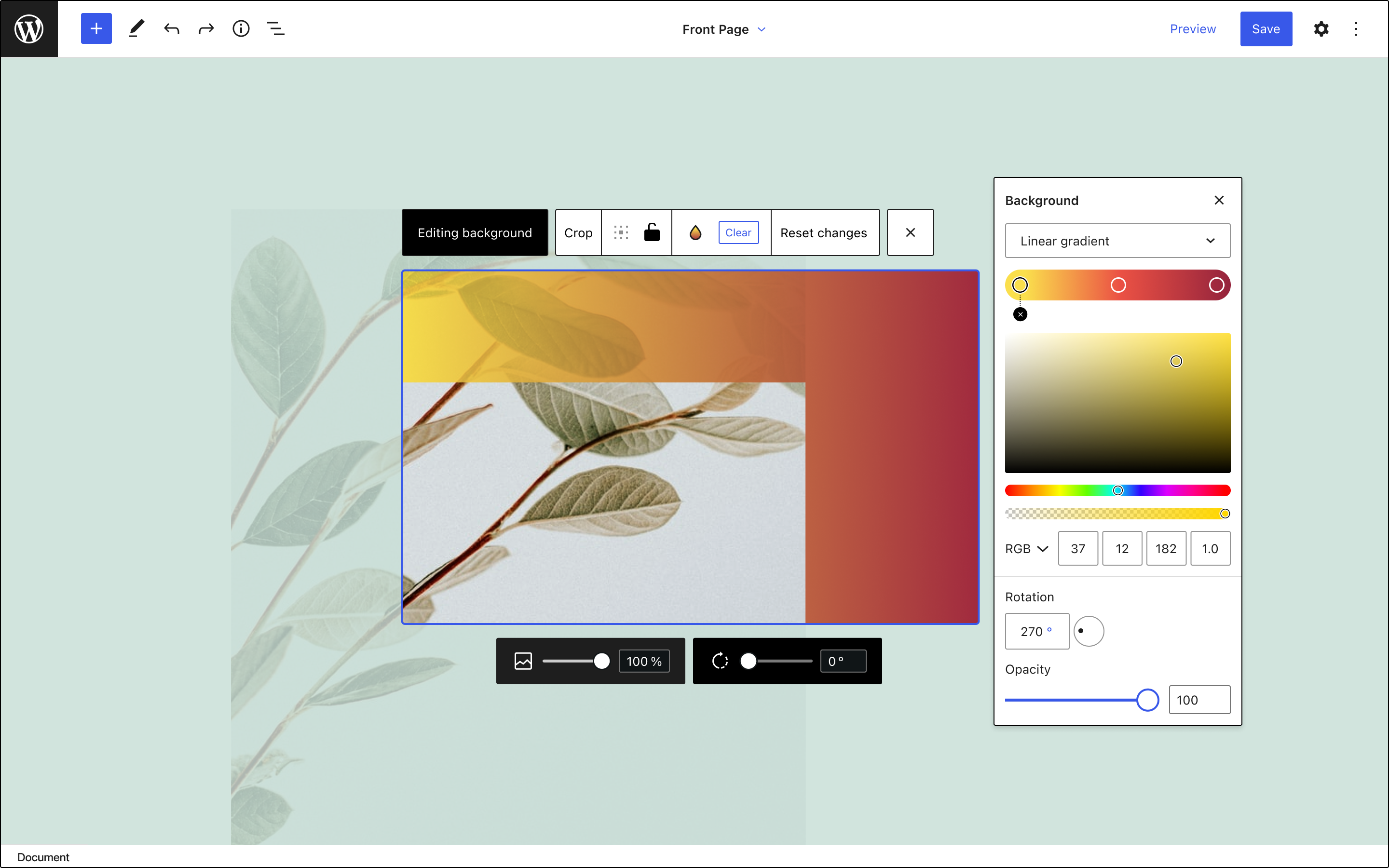
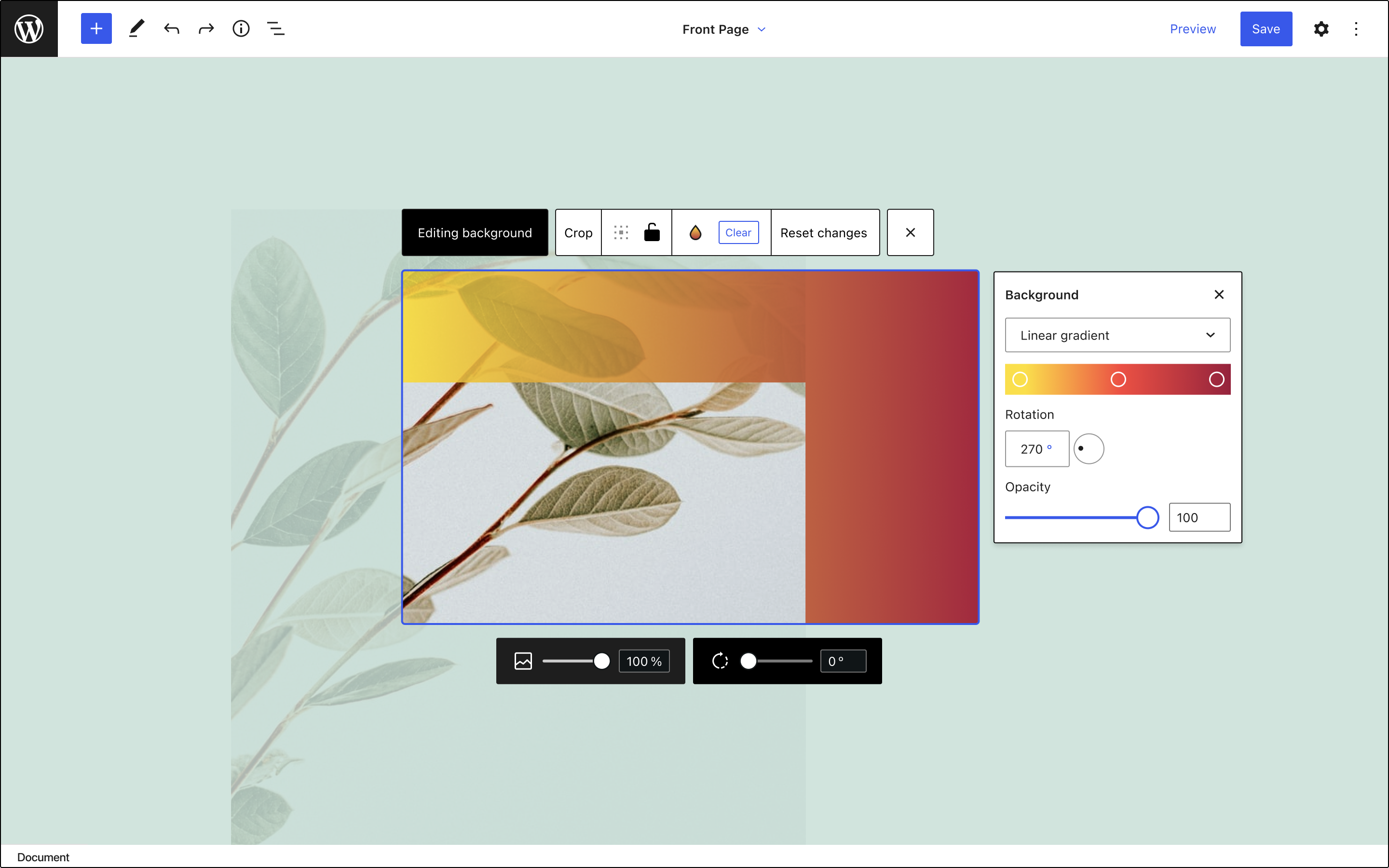
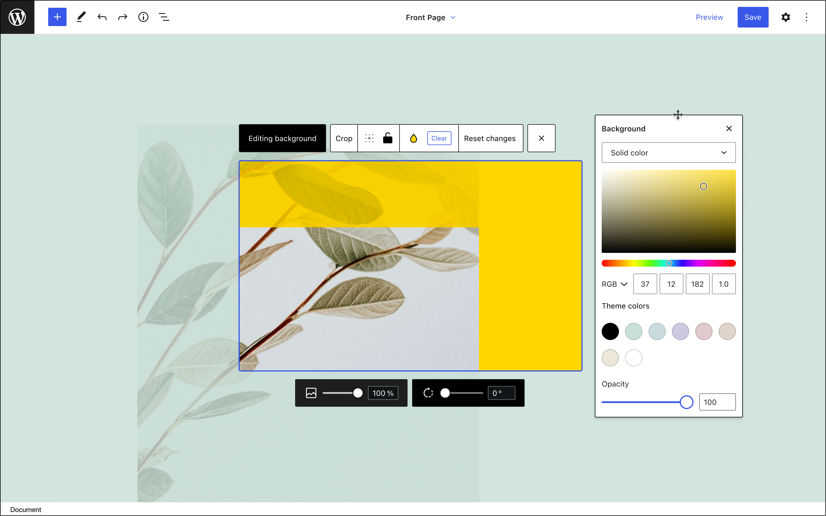
Background
Finally, the color icon in the toolbar gives access to setting the background of the block, and it’s managed through a popover that allows switching between a solid color or a gradient.
Here’s a Figma file with the designs for this exploration.