I’m opening this issue to propose several improvements and enhancements to this block and also to track existing Table block issues (you can find them at the end of this post).
This post is quite long, but I’d like to present the whole picture here and create the necessary new issues later so that the initial conversation can be more focused and centralized.
Many of the proposed changes require having multi-cell selection first. Others, like improving the initial placeholder state, could be addressed independently.
Here’s the Figma file that contains all the designs covered below, along with some explorations and references.
I’ve centered my work around these five main areas:
- The placeholder state
- Multi-cell selection
- The sidebar
- The toolbar
- Icon improvement
Placeholder
The current placeholder state is simple: users can set the number of columns and rows they want their table to have.

But these two numbers don’t give a clear picture of the kind of table the user is about to create, and since we don’t have a quick way to add new columns or rows (more on that later), creating the right table from the start is really important.
To solve this problem, we could offer an automatic preview that reflects the information entered by the user so that they can immediately see what the shape of their table will be.
Here’s an example of how this interface could look like:

- The table in the preview gets updated whenever the user adds or removes rows and columns.
- The height of the preview window is fixed, so the input elements below won’t move.
- If the user creates a large table, we can show an ellipsis implying that the table contains rows or columns that are not being shown.
Another idea based on this UI is the possibility to resize the table using the preview interface itself: if the user hovers the cells and then clicks one of them, the table gets resized automatically.
Multi-cell selection
This is the biggest change in the Table block and would allow creating more complex designs than the ones that are possible right now.
Adding this feature would require refactoring the block and use inner blocks, so that cell is a block of its own. There’s been some talk around this topic in this issue.
To illustrate how this feature could work, here’s how Google Docs and TinyMCE do multi-cell selection.
Google Docs
The nice thing about multi-cell selection in Google Docs is that it’s possible to select one single cell. However, it’s not possible to select the entire table in an easy way (except, obviously, by highlighting all the cells with the mouse cursor).
In contrast, in the TinyMCE editor it’s possible to select the whole table by clicking on it. Strangely, you can’t select just one single cell.
I believe our tables should support these two basic use cases: single-cell selection and the highlighting of the whole table. That would make the styling process much easier.
Two other handy features we could offer would be: merging and splitting.
Merging
Some apps like Google Spreadsheets offer several types of merging: horizontal, vertical, or full merge, depending on the direction in which the cells get merged.
I think we could start by offering the full merge, as shown in the example below.

Google Spreadsheets also offer the option of “unmerging” a previously merged group of cells, which is a way to reconstruct the previous structure of the table. This is an advance use case that I don’t think we need to cover at this moment.
Splitting
Microsoft PowerPoint also allows to customize the splitting of cells. In our case, we could offer two options for splitting: horizontally or vertically. The reason to offer two ways and not automatically divide rows horizontally and columns vertically, is to support the case where a user just want to split a single cell. In that case, it makes sense to give the option to the user to pick the method they like.

Sidebar
Right now is only possible to change the text and background colors of all the cells at the same time. If we had mulit-cell selection in place, users would be able to customize their tables in many different and interesting ways.
These are the sections I think we should include in the sidebar:
- Styles
- Table Settings
- Border Settings
- Typography
- Color
- Advanced
Let me review each the first five of them:
Styles

This section could show four several common table styles. Instead of using gray to color the cells, we could use the default main color defined by the current theme.
These styles set and combine basic elements like stripes, and the presence of header, and footer rows. In the case of the last one (‘Left column’), it also sets the background color of a group of cells.
Table settings

In this section, I would add a controller to modify the dimensions of the table, since the only way to do this at the moment is using the toolbar (and that requires two clicks to add or remove a column or row of cells), which makes the process of modifying the dimension of a table a bit tedious.
Besides this section, another handy way to add more rows to a table could just be pressing the tab key in the last cell, like other apps do. I would also allow using the Tab key to traverse the cells.
Border Settings

This section would allow users to change the border settings for each cell or if it’s selected, the whole table.
With the idea to allowing to style tables in many different ways, we could also offer a special control (similar to the padding one) that would allow setting the width of each of the selection borders independently.
Color settings

Instead of changing the color settings of the whole table, this section would only affect the selected cells. This section would also offer the possibility to create a zebra-striped table (important thing though: the user could still overwrite the stripe color setting the background color with the control above).
Typography

Nothing shocking or revolutionary here: we should allow changing the style of the text for each cell and the table caption.
The toolbar
If we were to implement all these changes we would end up having at least 10 actions that could go in the toolbar. Instead of having one single option that give access to all the available actions, we could group them by category.
We could have three categories: insert, remove, and cell operations.
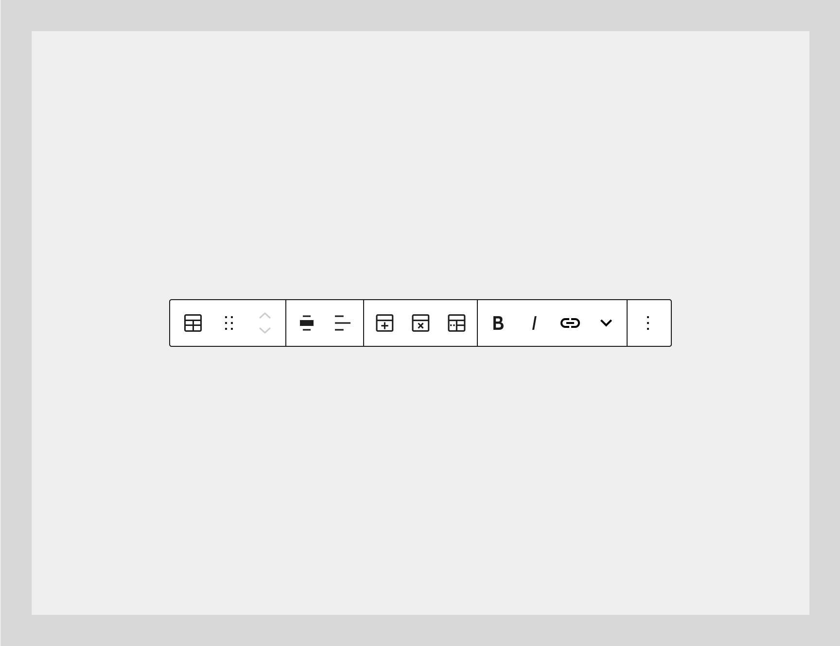
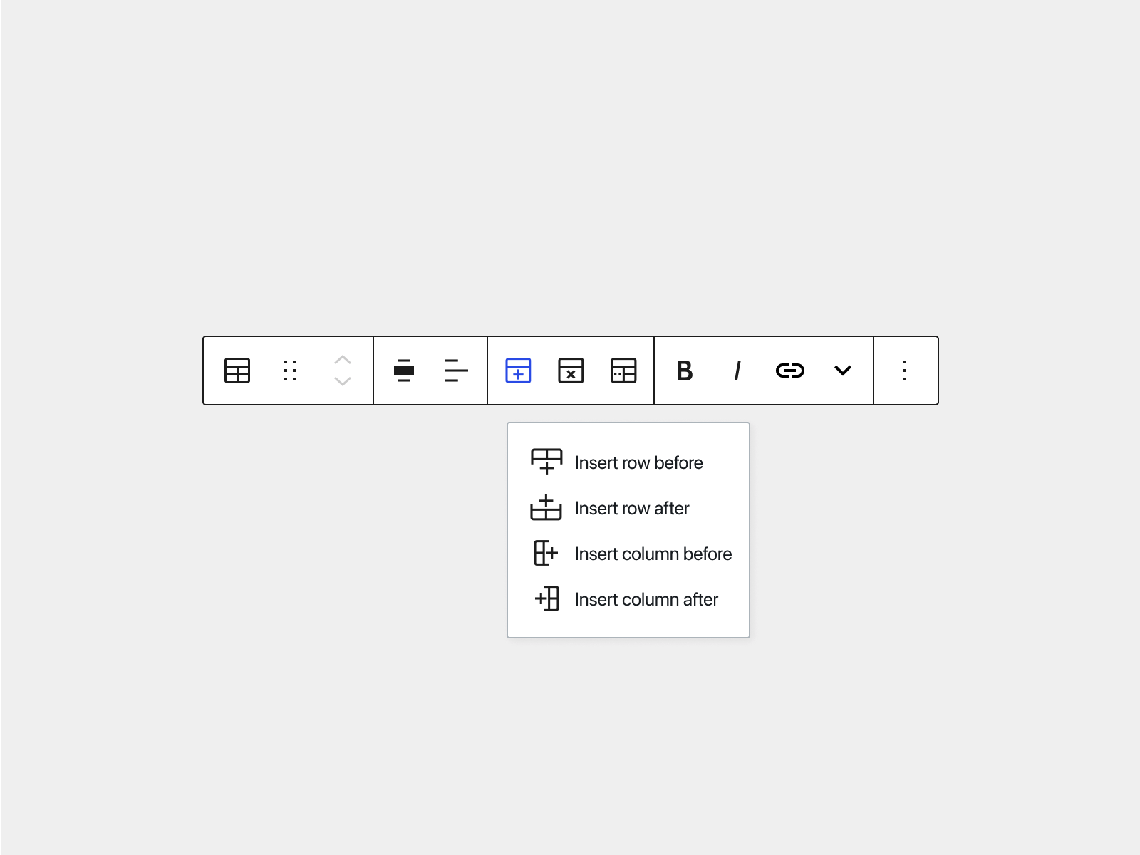
- Insert would give access to all the additive operations: insert row before, insert row after, insert column before, and insert column after.
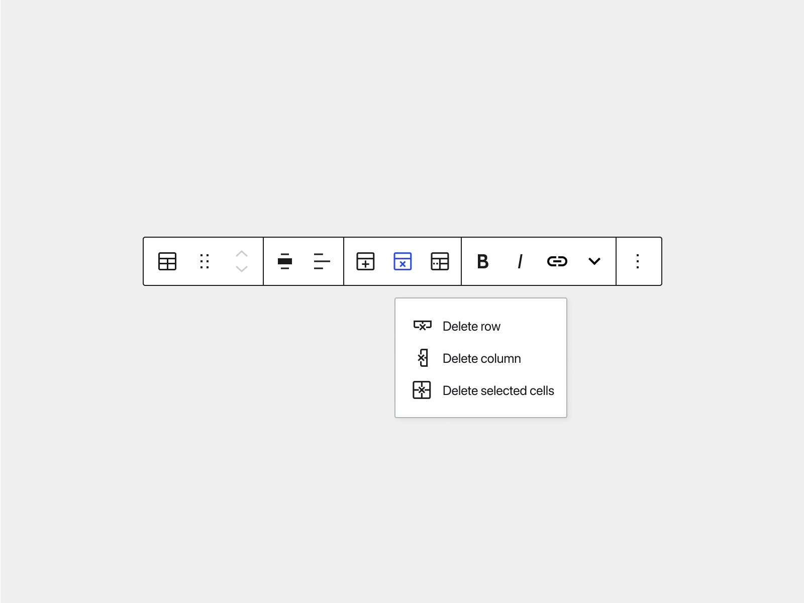
- Delete would give access to all the destructive operations: delete row, delete column, and delete selected cells.
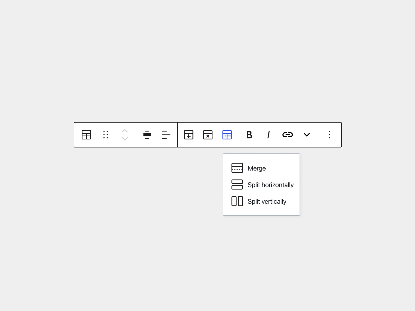
- Cell operations would give access to merge, and split horizontally & vertically.
Icons
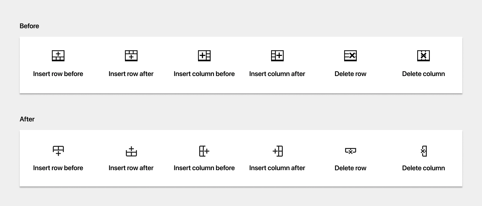
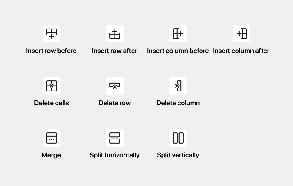
I’m also proposing to update several icons to make them faster to read and use the same kind of design language (i.e.: border radius, line widths, etc.) as other current icons. Here’s a first exploration:
And this is the full set of icons (again, an initial exploration) that also include the Split, Merge, and Remove cells icons.
Features
- [ ] #30096 Add controls for font sizes
- [ ] #18766 Add background colors to individual cells, rows, or columns
### Feature: merge + range selection
- [ ] #15821 Merge/Unmerge cells (+ trac)
- [ ] #12115 Not possible to select range of cells for formatting
- [ ] #16294 Allow selection of entire rows and columns
- [ ] #18768 Should we use InnerBlocks?
Enhancements
- [ ] #29833 Recognize Markdown when pasting a table from Google Sheets
- [ ] #16478 Add ability to disable Color Settings on Table Block
Bugs
- [ ] #24393 Table Headers shouldn’t default to break-word
- [ ] #12525 The RichText within the table cells shouldn’t have role=textbo…
- [ ] #31237 Various Block Bug Report Thread
- [ ] #8401 Scrolling is not evident when a browser/device hides scrollbars
- [ ] #30876 Figure table’s figcaption HTML is not persistent when pasted
- [ ] #31261 Continued enhancement of color options
- [ ] #30468 Stop Offering “Block Recovery” for HTML Blocks
- [ ] #30091 Performance with large number of rows
- [ ] #13154 Ability to add ordered and unordered lists to tables
- [ ] #23617 Make wrapping tables in figure tags optional
- [ ] #26716 Setting Default Style in Button block doesn’t make post dirty
- [ ] #12294 Layout fixed has 100% width
- [ ] #28714 Edit table actions are unclickable after inserting a new table
To organize
- [ ] #27480 Image caption styles global styles support
- [ ] #24205 Finish resolving accessibility issues with Table Block
- [ ] #18622 Option in panel to set horizontal to vertical orientation a…
- [ ] #16355 Consider bringing in layout options to table block
- [ ] #16045 Block Library: Table: Consider “Fixed width table cells” as default
- [ ] #12116 Not possible to cut, copy paste one or more cells within exi…
- [ ] #6923 Flesh out editor features
Issues I think we could close
The following two issues are outdated, and I think we could close them:
- 27651 Add controls for border width
- 17801 Add Border Colors
One response to “Table block”
test